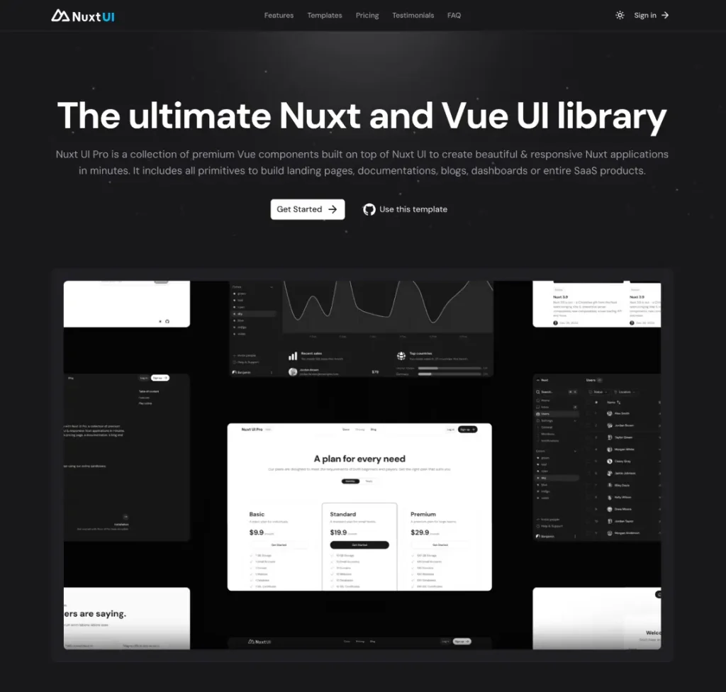
The Nuxt UI Design Kit includes over 100 customizable components, premium templates, and full design token implementation using Figma variables.
It provides designers working on Nuxt.js projects with exact visual and technical consistency between design and development environments.
Features
- 100+ production-ready components built with Auto Layout
- Complete design tokens using Figma Local Variables
- Light and dark mode implementations
- Tailwind CSS v4-aligned spacing, colors, and typography
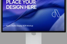
- Premium templates: Dashboard, SaaS, Landing, Docs, Chat
- Responsive-ready components with variant properties
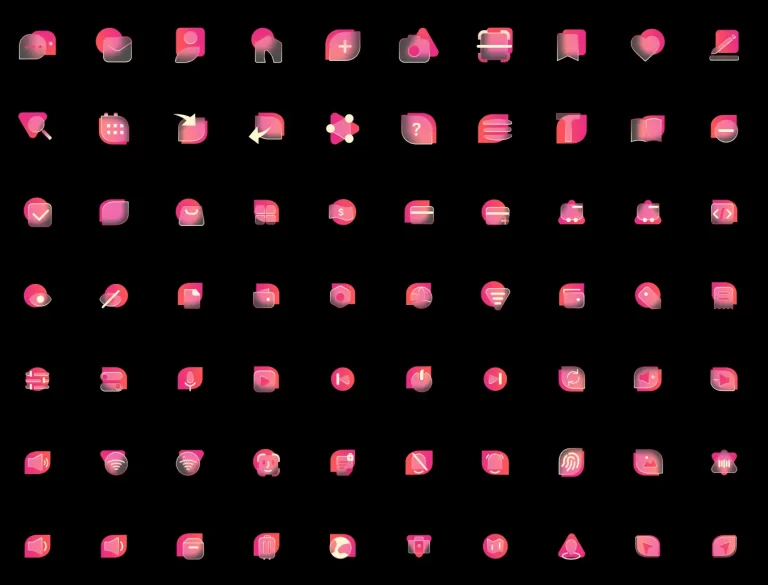
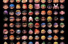
- Integrated Lucide and Simple Icons library (1500+ icons)
Use Cases
- Designing Nuxt.js applications with guaranteed component consistency
- Creating dashboard interfaces using pre-built responsive components
- Developing marketing sites with landing page templates
- Building documentation portals with ready-made content layouts
- Implementing accessible form systems with validation components
The Nuxt.js Official UI Design Kit in Figma was generously created and offered for free by Nuxt - download it now to enhance your next project with a professional-grade asset at no cost.
Unless otherwise specified, you can download and use it free for personal project.
If you encounter a broken or invalid download link on our site, please let us know through our Report Broken Link form.
If you mention it somewhere else, please always link to this page instead of download link.
DISCLAIMER::This free resource is aggregated from the web - we do not claim ownership or hold rights to the design assets. If you find our shared resources infringe upon your copyrights, please let us know via feedback so we can promptly remove them.