
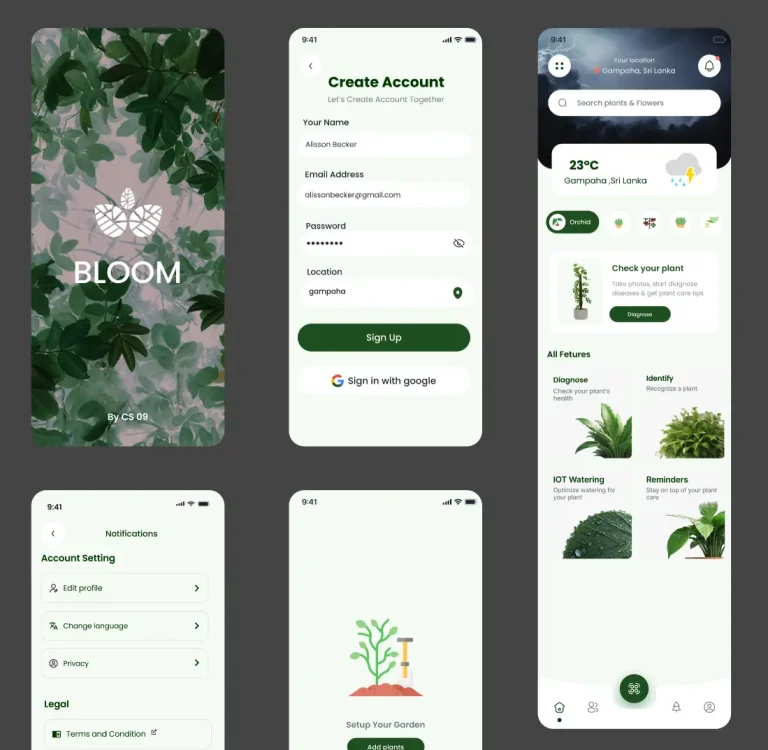
The official Microsoft Teams UI Kit contains the core components needed for building native Teams apps.
The kit includes scenario-based templates, accessibility guidelines, and responsive sizing rules.
Grab these elements to construct user flows that match the Microsoft ecosystem standards.
Features
- Core Components: Includes buttons, inputs, and navigation bars specific to the Teams interface.
- Scenario Templates: Pre-built layouts demonstrate common app capabilities and user flows.
- Accessibility Standards: Built-in guidelines ensure high contrast and readable text sizes.
- Responsive Sizing: Elements adjust automatically for different viewport widths using Auto Layout.
- Best Practices: Documentation within the file outlines official usage rules for the Microsoft ecosystem.
Use Cases
- Enterprise collaboration tools
- Internal HR management dashboards
- Educational plugins for Teams
The Official Microsoft Teams UI Kit for Figma was generously created and offered for free by Microsoft - download it now to enhance your next project with a professional-grade asset at no cost.
Unless otherwise specified, you can download and use it free for personal project.
If you encounter a broken or invalid download link on our site, please let us know through our Report Broken Link form.
If you mention it somewhere else, please always link to this page instead of download link.
DISCLAIMER::This free resource is aggregated from the web - we do not claim ownership or hold rights to the design assets. If you find our shared resources infringe upon your copyrights, please let us know via feedback so we can promptly remove them.


