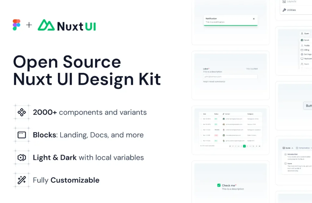
This is Nuxt’s Official Design UI Kit that includes 2000+ components and variants like DashboardPanels, AuthForms, and CommandPalettes.
Every layer aligns with Tailwind CSS v4 architecture for immediate frontend handoff.
Features
- Tailwind CSS: Spacing, colors, and typography map directly to the latest Tailwind architecture.
- Figma Variables: Global design tokens handle colors, effects, and typography for instant theming.
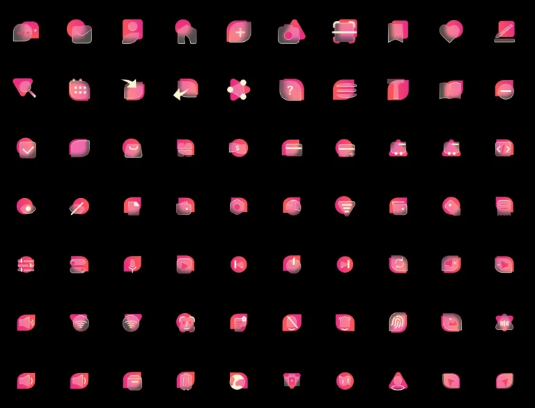
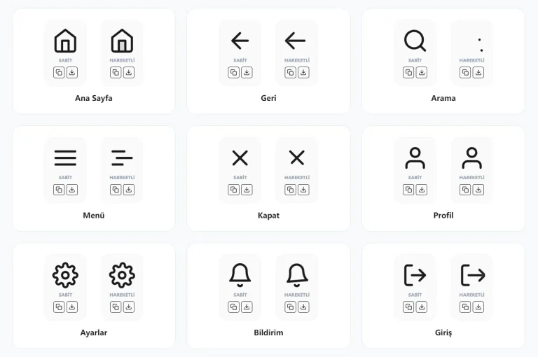
- Icon Integration: Includes 1500+ Lucide icons and a curated Simple Icons set.
- Layout Logic: All components utilize Auto Layout for responsive resizing and consistent padding.
- Theme Support: Built-in Light and Dark modes switch instantly via local variables.
Use Cases
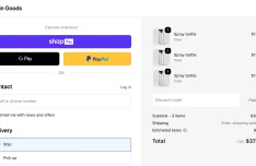
- SaaS Dashboards: Build complex admin panels using pre-built sidebars, data tables, and resize handles.
- Authentication Flows: Prototype login and registration screens with validation-ready form fields.
- Documentation Sites: Layout content-heavy pages using breadcrumbs, table of contents, and code blocks.
The Nuxt UI v4 Official Figma UI Kit was generously created and offered for free by Nuxt - download it now to enhance your next project with a professional-grade asset at no cost.
Unless otherwise specified, you can download and use it free for personal project.
If you encounter a broken or invalid download link on our site, please let us know through our Report Broken Link form.
If you mention it somewhere else, please always link to this page instead of download link.
DISCLAIMER::This free resource is aggregated from the web - we do not claim ownership or hold rights to the design assets. If you find our shared resources infringe upon your copyrights, please let us know via feedback so we can promptly remove them.


