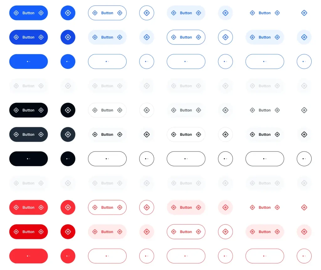
This is a free mobile button UI kit for Figma from the Appetite UI system.
It includes primary, secondary, tertiary, ghost, social, quick action, compact, and floating action button components.
You can use it to build mobile app interfaces, product prototypes, design system drafts, and reusable button libraries in Figma.
Key Features
- Free mobile button component kit for Figma
- Built on the Appetite UI system
- Uses real variants and live Figma Variables
- Includes primary, secondary, tertiary, and ghost button styles
- Includes social buttons for Google, Facebook, Apple, and X
- Includes default, hover, pressed, and disabled states
- Part of a larger mobile design system with 40+ components
What Is Included
- Primary, secondary, tertiary, and ghost button styles
- Social buttons for Google, Facebook, Apple, and X
- Quick action buttons with icon and label layouts
- Five quick action button color variants
- Compact buttons for modals, toasts, and inline actions
- Floating action button component
Best Use Cases
- Mobile app interface concepts
- Figma button component libraries
- Product prototypes
- Design system drafts
- Modal, toast, and inline action layouts
- Social sign-in screen concepts
The Mobile Button UI Kit for Figma was generously created and offered for free by Bohouš Poláček - download it now to enhance your next project with a professional-grade asset at no cost.
Unless otherwise specified, you can download and use it free for personal project.
If you encounter a broken or invalid download link on our site, please let us know through our Report Broken Link form.
If you mention it somewhere else, please always link to this page instead of download link.
DISCLAIMER::This free resource is aggregated from the web - we do not claim ownership or hold rights to the design assets. If you find our shared resources infringe upon your copyrights, please let us know via feedback so we can promptly remove them.
